VisitUW
Feel free to take a look at our prototype me and my group made for the UW Visitor Center: UW Visitor Center App Prototype. This was definitely one of the more fun ones!
We decided to build a mobile application for the University of Washington. More specifically, we wanted to create an application that would help tourists find attractions that they may find interest in while visiting the University of Washington. This application would also serve prospective students, assisting them in exploring student life at UW. Our goal is to potentially have more people visit the UW as a tourist destination while also encouraging more prospective students to attend UW. Our team had a handful of app features that we wanted to include: an interactive campus map that highlights popular landmarks, a registration process for UW events/tours, and viewing student-life related information. We followed several steps that guided us in creating our protype. We first needed to do an initial whiteboarding for our app. Our group sketched out, on paper, various pages to solve the visitors' needs. For each feature that we wanted to implement, we sketched out every screen necessary that visitors needed to go through.
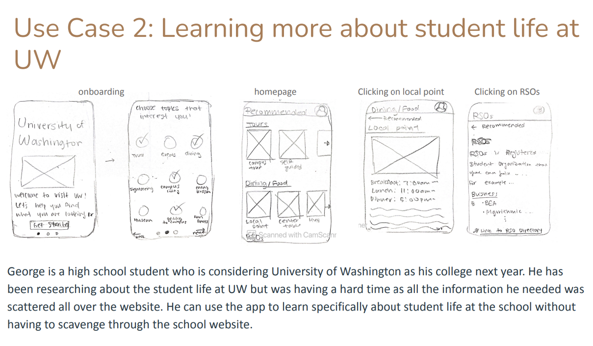
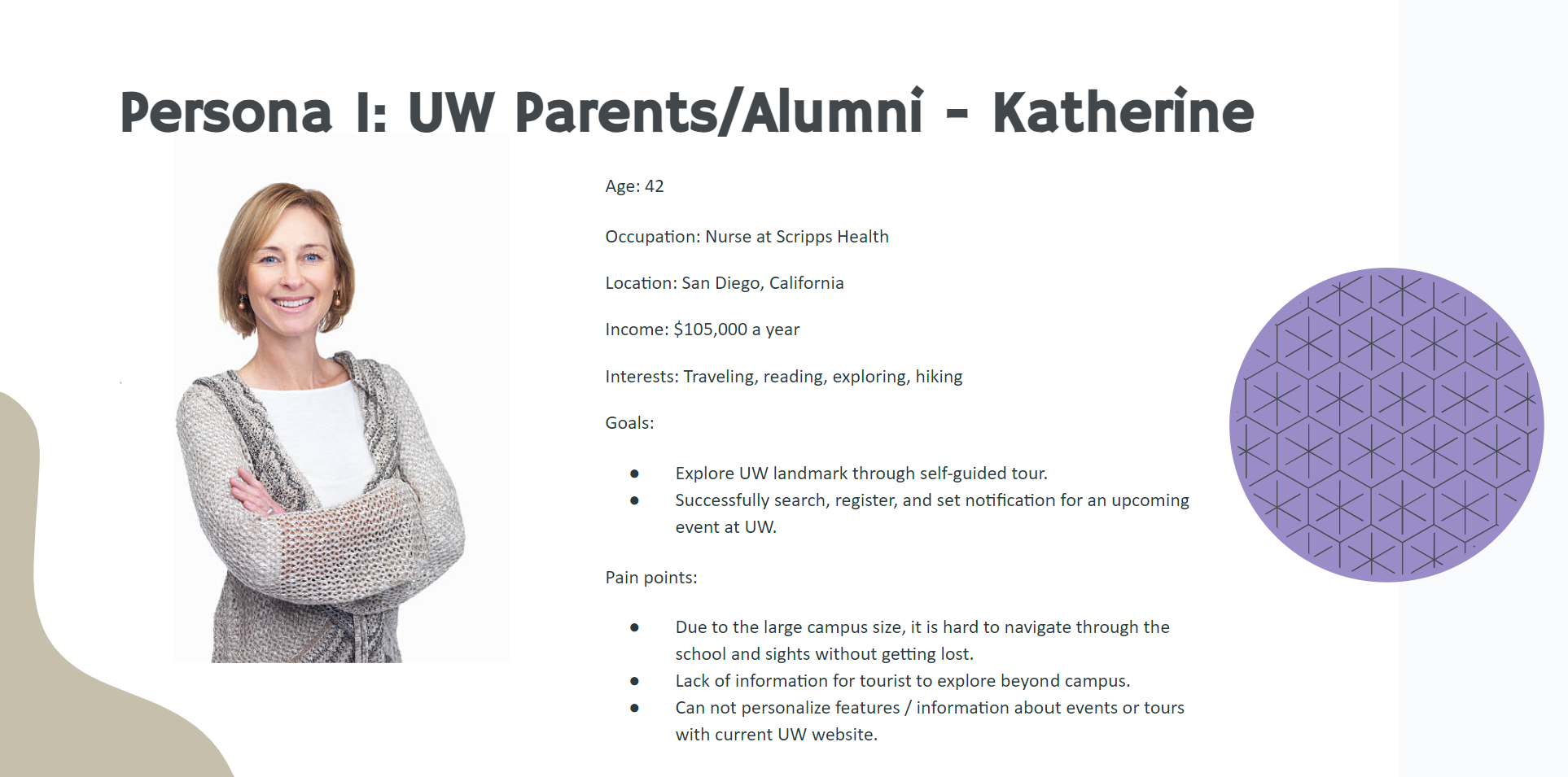
We also created user personas. User personas were profiles that represented a subgroup of our target audience, and helped us to make decisions about how we implement our app. The two user personas that we had were students and parents. High school students would seek out information about campus tours and learning more about student life at UW. Parents would be more interested in seeing interesting attractions around UW. Both parents and students would be interested in registering for various UW events that are happening on campus (eg. Concerts, public lectures, and more).
After whiteboarding and creating user personas, we made our initial wireframes on Figma. These wireframes consisted of all the screens we sketched out and included a UI system for labeling and navigation. In order to get feedback on our wireframes, we decided to conduct a qualitative study, where we interviewed 5 people to use our product and answer questions about them. This qualitative study informed our team about the aspects of our app that were smooth and easy to navigate, and others that were confusing and difficult to use. We realized that we needed to fix various parts of the: registering for a tour was very confusing with the calendar, events needed to be categorized so people can easily navigate through and addressing accessibility issues. We addressed these concerns, and continued to polish our app. Within the span of four weeks, we were able to make a prototype of the UW app! Feel free to take a look here: UW Visitor Center App Prototype. We had a lot of fun doing this project!
INFO 360: Design Methods
Before embarking on this project, I took a class called INFO 360. INFO 360 is a course that analyzes the process of creating a user interface, discussing what makes them effective, and applying theories that guides us in being good Information Architectures. Our assignments consisted of wireframes, sitemaps, information design and a final project. While this class primarily focuses on user interfaces for handheld devices, we learned about the basic principles of user interface design, methodologies and best practices for achieving user goals, and using user centered approaches in the product development process.
Heuristics Report
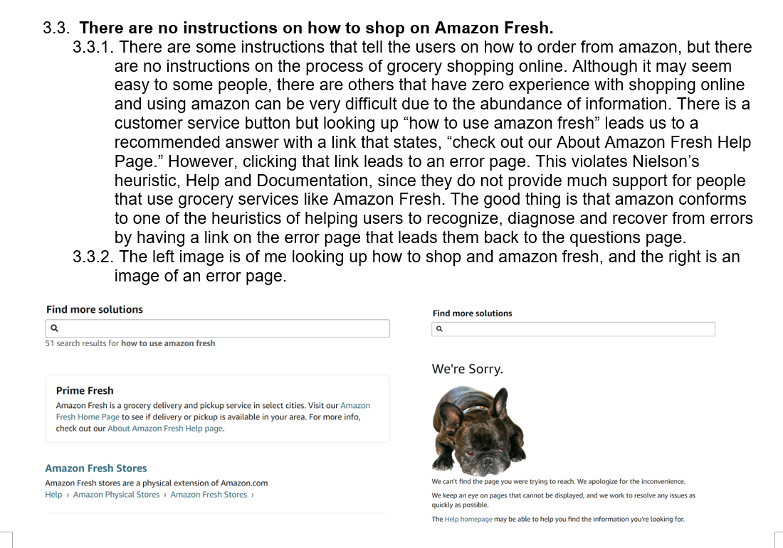
There were a handful of assignments in which we analyzed user interfaces and judged their usability. One of our assignments tasked to us was to create a heuristic report for a web application. Heuristic reports are a way for designers to analyze design problems in a user interface and find ways in which we can improve the customer experience. I chose one of Amazon's websites, specifically Amazon Fresh, and judged their web application based on these evaluation keys: Situational Awareness, Supporting Mental Models, and Supporting User Goals. For Situational Awareness, we needed to determine the cognitive ease of a user to naturally understand where to find things and how to do site tasks. For supporting mental models, we needed to evaluate whether actions and labels accurately describe what users would expect them to do or mean. Supporting User Goals determined whether actions and labels accurately describe what users would expect them to do or mean. Before doing the assessment, we also learned about Jacob Nielson's heuristics. His heuristics were general principles that guided designers in creating a user experience that felt intuitive and clear to visitors visiting the website. While doing my heuristic evaluation, there were a handful of violations that I found to Jacob Nielson's heuristics. Their website easily overwhelmed users with an abundance of information shown to them, conventions were not consistent across the entire platform, and their UI made users recognize certain aspects of the website rather than recall. While completing this task, it really geared me into how designers need to look at various heuristics in order for viewers to have a good user experience. Tapping into a good user experience can build an excellent relationship between the users and the business and ensure that users continue using services like Amazon Fresh. One of the positives with Amazon Fresh's website is that they make it super easy for users to look for a specific item using the search bar. The search bar gives suggested results, adhering to the recognition rather than recall strategy.